Building Kuwait's First Digital Wallet and Payments App from Zero
Before a single screen was designed, I moved to Kuwait. Relocating gave me direct access to user mental models, on-ground behaviours, and adoption barriers no remote research could uncover. As a Head of Product, I owned the 0 to 1 build of the country's first eWallet — research, branding, product strategy, design systems, team building across Kuwait and India, and CBK compliance. Not just designing an app, but making the case for why digital payments belonged in Kuwait at all.
There was no product. No team. No design language. No playbook. Just an ambition to build Kuwait's first digital eWallet in a market that had never needed one before. Cards worked. Cash was king. Apple Pay served the iPhone crowd. The real question was never "how do we design a wallet?" It was something harder: how do we make an entire country reconsider how they pay?
That question defined everything I did for the next 18 months.
The Market Nobody Had Cracked
Kuwait's population is one of the most demographically diverse in the world. Native Kuwaitis, a large Indian and South Asian diaspora, Egyptians, Europeans, Americans — each carrying entirely different relationships with money, technology, and trust. My first job was not to design. It was to understand.
I relocated to Kuwait specifically for this. I spent months immersed in how people actually lived, not just how they paid. I studied phone usage behaviours, daily routines, social patterns, and financial habits across communities. What I found was a fascinating paradox: a population deeply hooked on Snapchat, Instagram, and Facebook, highly visual and highly engaged with digital experiences, but almost entirely reliant on physical cards and cash the moment money was involved.
The digital behaviour was there. The digital payment trust was not.
The Insight That Changed Everything
Between two extremes sat the real design challenge. On one end: cash and cards, deeply habitual, universally trusted. On the other: Apple Pay, fast and contactless, but exclusive to iPhone users and still a small slice of the population. Finding the sweet spot between those two spectrums was the central research problem.
The most important insight came from studying native Kuwaitis specifically. This is a population with significant purchasing power and a strong cultural relationship with status, aesthetics, and premium experiences. They were not resistant to paying digitally. They were resistant to paying digitally with something that felt ordinary.
That single finding became the strategic foundation for everything that followed. The product had to feel premium, not just functional. It had to signal something about the person using it, not just work quietly in the background.
From Wallet to Ecosystem
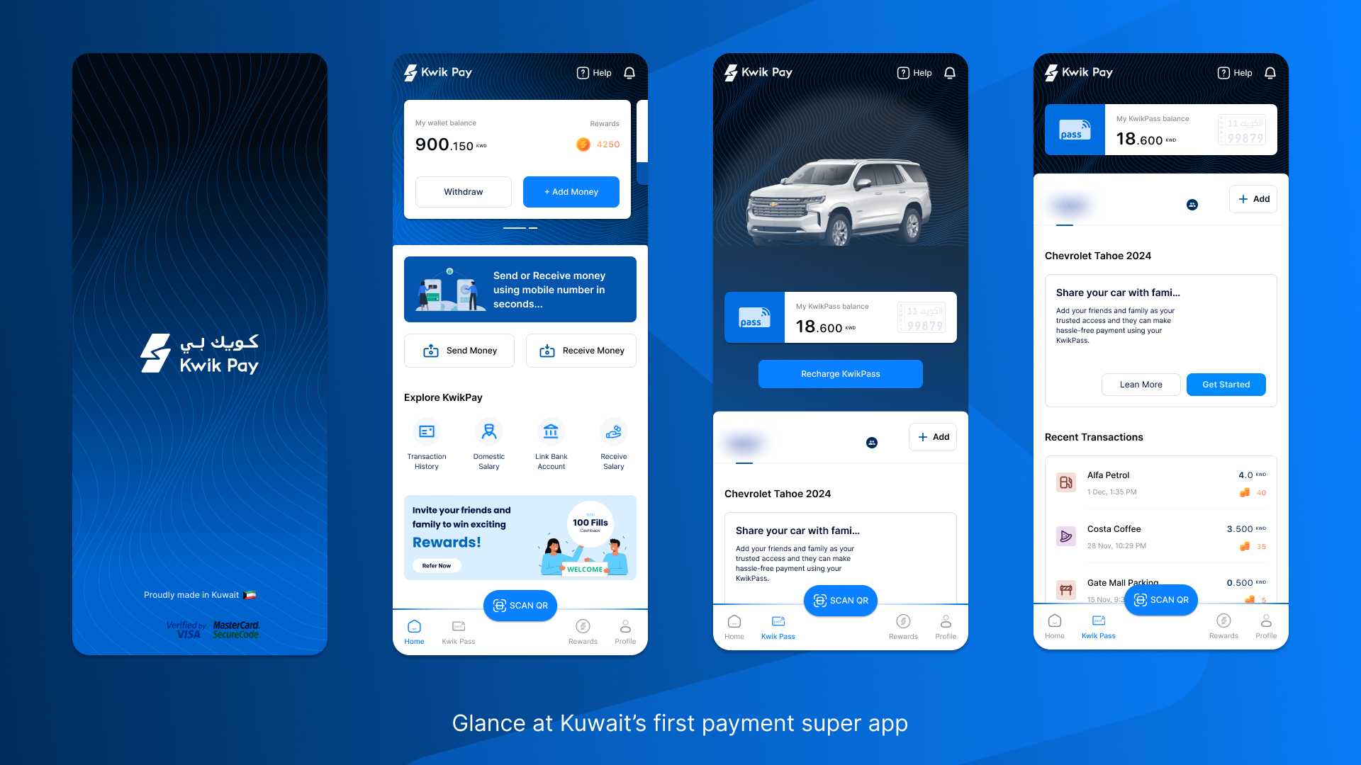
Most wallets are built as utility products. We built KwikPay as an experience product, with a design language deliberately more advanced than anything the Kuwaiti market had seen, drawing visual inspiration from the social apps people already loved and used daily.
The interface had to feel familiar enough to not intimidate, and refined enough to earn trust and desire. For a market being introduced to digital payments for the first time, the aesthetic was not decoration. It was the argument.
The KwikPass Bet
KwikPass started as a feature brief: an RFID-based tag for cars enabling contactless payments at fuel stations, parking lots, and drive-throughs. I pushed back on that framing immediately. A feature lives buried in a menu. A product gets its own real estate, its own identity, its own story.
I convinced the founding team to position KwikPass as a standalone product within the KwikPay ecosystem, with its own section in the app's navigation, its own visual identity, and a dedicated experience built entirely around the car. Open KwikPass and you see your vehicle, your linked services, your fuel and parking spend, and your pass status. It was not a payment toggle. It was a product.
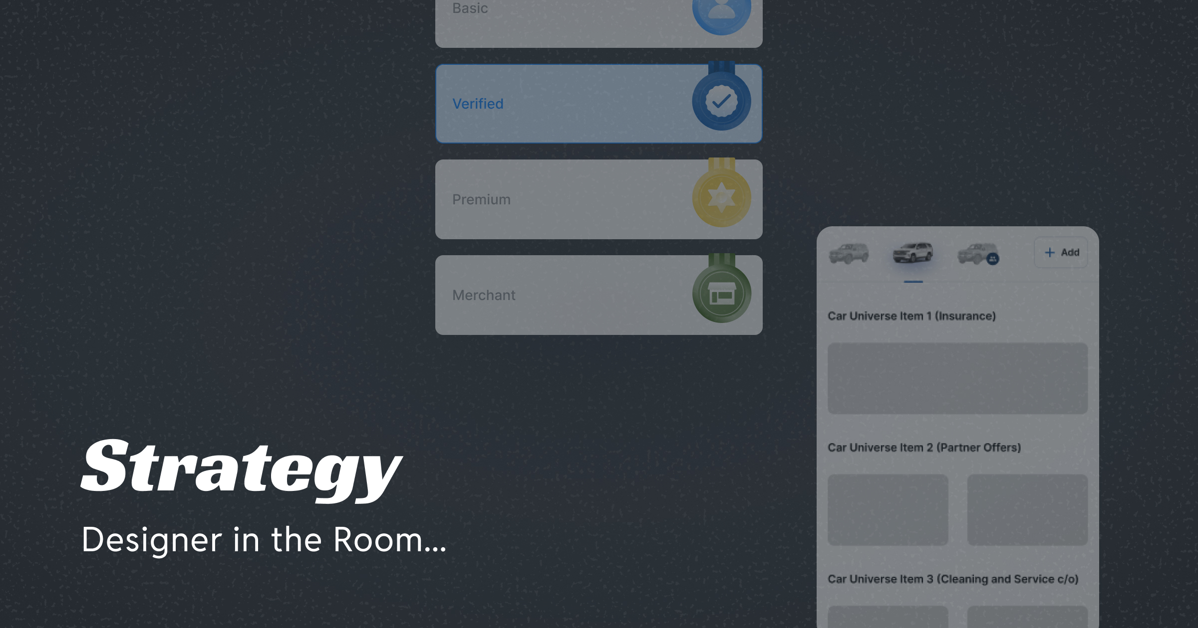
The research insight about premium aesthetics and status shaped the monetisation directly. We introduced a tiered pass system: a standard blue tag and a gold tag for premium subscribers. For a native Kuwaiti with high disposable income and a genuine relationship with exclusivity, paying a meaningful premium for a gold sticker on their car — one that signals membership in a higher tier — was not just acceptable. It was something they would seek out. That behavioural insight went straight into the business model.
I also developed the case for taking KwikPass beyond individual consumers, building out a B2B and B2B2C strategy targeting fleet operators, corporate accounts, and fuel station partnerships. The physical RFID tag on the car was not just a product accessory. It was a brand touchpoint in the real world, one that could scale through institutional channels.
Designing for a Market That Had Never Done This Before
Designing a zero to one product for a market with no prior digital payment behaviour meant every screen had to do double duty: guide a first-time user while also feeling sophisticated enough to earn the trust of someone used to the seamlessness of Apple Pay.
I defined the full design language for KwikPay from scratch, establishing the visual principles, component patterns, interaction guidelines, and design system that the entire team built on. Alongside the digital product, I also conceived and named both KwikPay and KwikPass, defining the naming architecture and brand language that would shape how the product was perceived in the market.
Every design decision was run through two filters: does this make sense to someone who has never used a digital wallet, and does this feel worthy of someone who has?
Building the Team and the Machine
A product is only as good as the team building it. I hired and structured a lean product and design team of 4, recruiting across Kuwait and establishing an offshore development model in India to support parallel workstreams and faster iteration.
I introduced design reviews, sprint rituals, async workflows, and a shared design system that gave the team a single source of truth across every product surface. Beyond process, I was deliberate about mentorship, defining levelling expectations for designers and creating space for them to grow their craft, not just ship tickets.
On the technology side, I orchestrated the adoption of server-driven UI architecture across the product. The goal was straightforward: decouple product and design updates from app store release cycles so the team could iterate at speed post-launch without being bottlenecked by Play Store or App Store timelines. I worked closely with engineering to define the component model, design contracts, and implementation methodology. I defined the approach and the rationale. The engineering team built it.
Shipping Under Pressure
With the product vision defined and the team in place, execution became the only thing that mattered. We were building in a heavily regulated fintech environment under the Central Bank of Kuwait, one of the most rigorous compliance frameworks in the region, while simultaneously trying to move at startup speed.
I introduced a hyper-sprint model that compressed what would typically be months of iteration into focused, high-intensity cycles. The team lived the product. We delivered a fully functional, compliance-ready application in 30 days.
The product successfully cleared CBK compliance review, a milestone that validates not just the product's integrity but the team's ability to build responsibly and at pace in one of the most demanding regulatory environments in the Gulf.
What This Built in Me
KwikPay was the most complete product leadership experience of my career. Not because everything went smoothly, but because almost nothing was given. The market, the team, the product, the strategy, the brand, the technology approach, the investor narrative — all of it had to be created from a standing start, in a country I had moved to mid-career, under regulatory scrutiny, on a timeline that left very little room for anything but clarity and conviction.
The product has not launched commercially yet. Fintech timelines in regulated markets rarely move on product schedules, and I stepped away before GTM. But what exists is a CBK-compliant, fully designed and developed eWallet with a differentiated product strategy, a premium brand identity, a novel physical-digital product in KwikPass, and a monetisation model grounded in real user research.
That is what I built. And I would do it again.
Case studies covering the research process in depth, the KwikPass product design, the technology decisions, and how the team was built are linked below.
Deep Dives

Researching Consumer and Merchant Behaviour for a Country's First eWallet With No Local Precedent
Kuwait had high digital readiness and deeply entrenched cash behaviour. This case study is about the work that happened before the design work — the immersion, the merchant conversations, the competitive insight that reframed the entire product. All before a single wireframe existed.
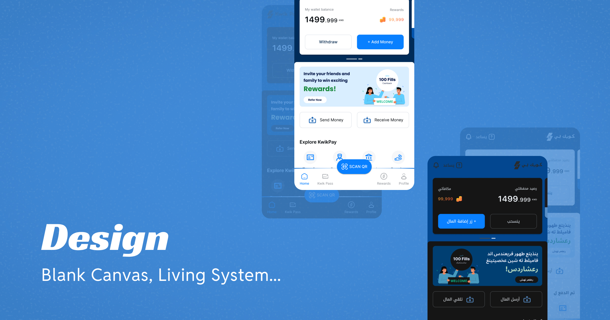
Building a UX, UI and Design System That Could Scale Across Themes and Multilingual RTL Environments From a Single Source of Truth
From blank canvas to a system that scaled across themes and RTL without duplication — this case study covers the UX, UI and design system work for Kuwait's first eWallet, and the unexpected learnings that came from designing for an Arabic audience for the first time.
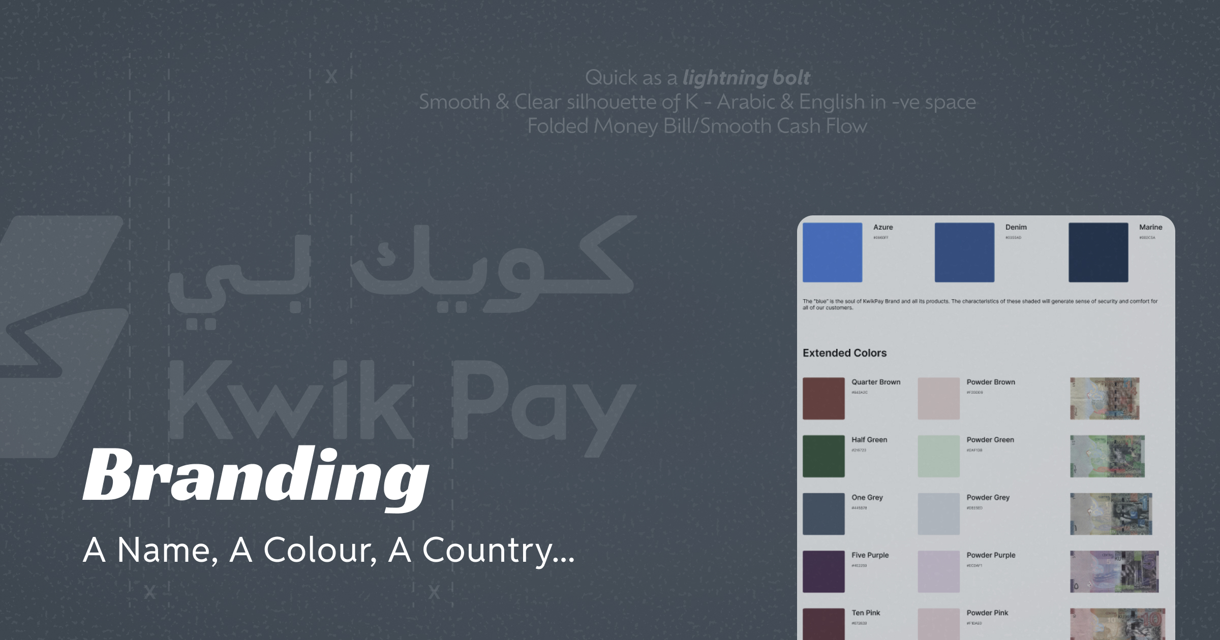
How a Country's Currency Became the Foundation of a Fintech Brand Identity
The secondary colours of KwikPay were derived directly from the Kuwaiti Dinar. This case study covers how a brand identity for two distinct but related fintech products was built from that single cultural insight — through naming, visual identity, brand book and creative direction for illustrations, icons and motion.
Building the Commercial and Strategic Foundation for Kuwait's First eWallet
This case study is about the work that does not show up in a Figma file. Pitch decks, partner and banking meetings, and product roadmaps for the merchant app and KwikPass — the commercial and strategic layer that turned a product vision into a business case for Kuwait's first eWallet.