The brief finally existed. After weeks in the field, we knew what the product needed to be, who it was for, and what behaviour it had to work with. Now came the harder part.
Building it.
There was no design system to inherit. No component library to start from. No existing fintech product in Kuwait to learn from or react against. And the product had to work across multiple languages — Arabic, English, Hindi, Bangla and more — spanning both LTR and RTL scripts, light and dark themes.
The temptation in that situation is to open a blank file and start drawing screens. I did not do that. The first thing I built was not a screen. It was the system that would make every screen possible.
Before the First Screen, the System
The decision to build the token and variable structure before touching a single screen was not obvious at the time. It felt slow.
The founders wanted to see screens. The engineers wanted something to react to. But I knew that without the system in place first, every decision made on screen one would need to be manually replicated across every other variant. Every colour change, every spacing adjustment, every typography decision — multiplied across themes and scripts, every time.
So the first few days were spent building what nobody would ever see directly but what everything else would depend on. Colour tokens mapped at every level — from primitive values to semantic roles to component specific applications. Typography tokens covering scale, weight and script specific adjustments for both LTR and RTL. Spacing tokens that would hold the layout together without needing to be overridden every time the language changed.
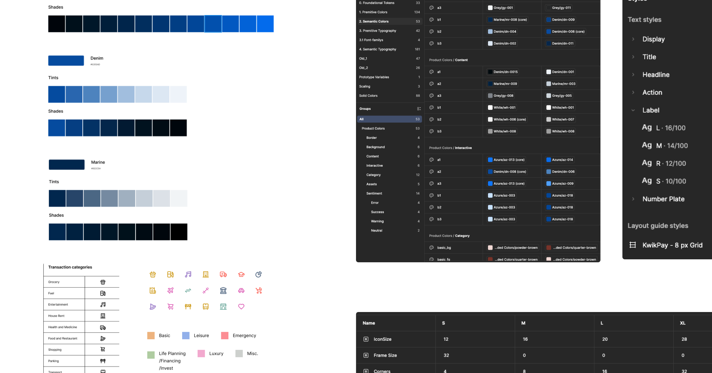
Alongside the token system, I made a foundational layout decision that would shape every screen that followed.
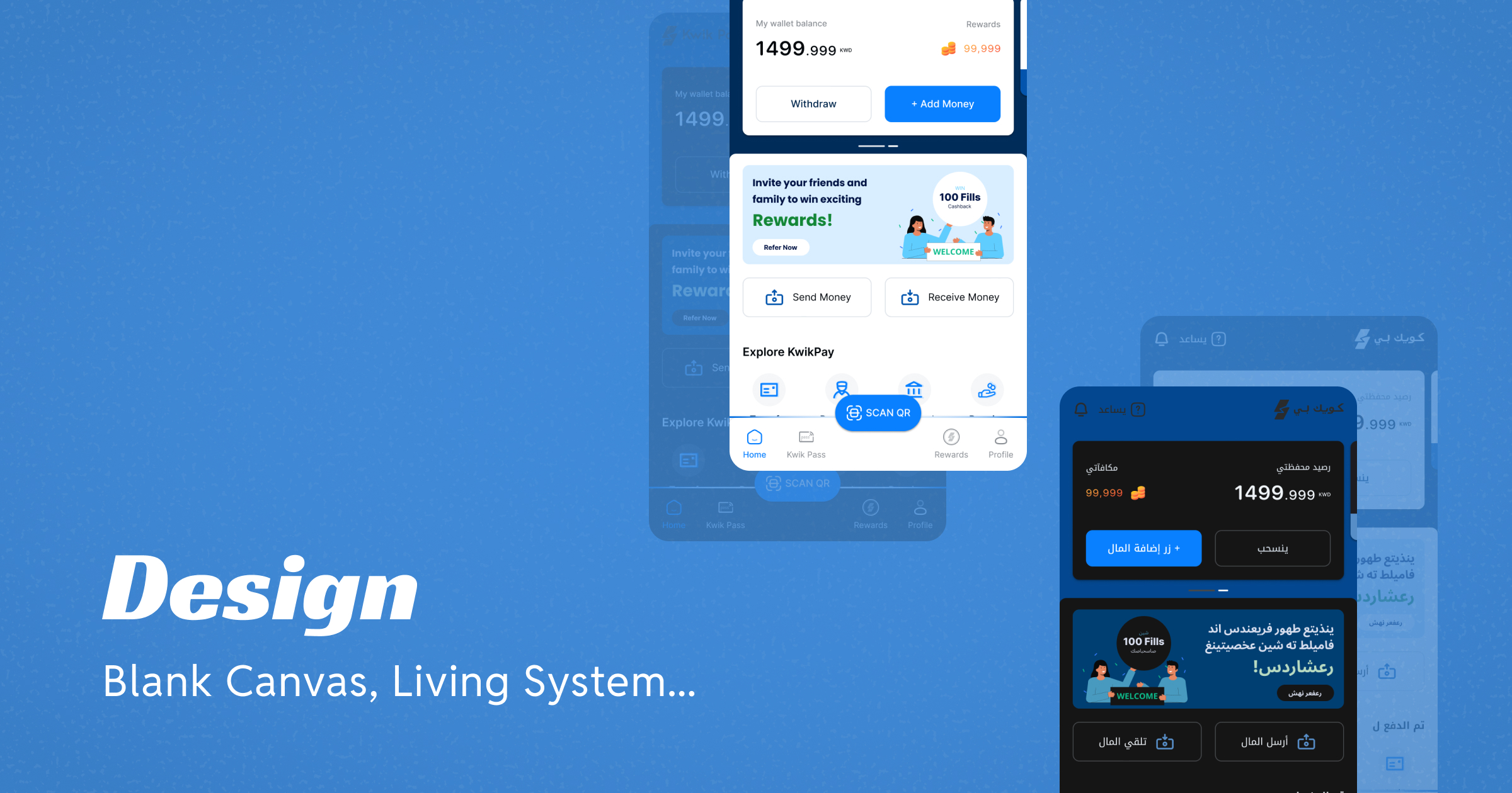
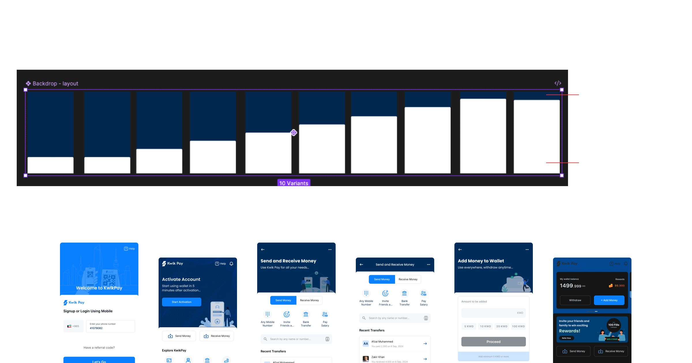
The UI was structured around two distinct layers — a foreground and a background. The foreground was a flexible top sheet that housed all active, interactive components. The background was a passive layer for branding, contextual information and visual hierarchy. The ratio between these two layers was not fixed — it shifted depending on the screen, the context and how much active interaction was needed at any given moment.
That single structural decision gave every screen a consistent spatial logic regardless of which theme or language was active. It also gave the product a visual rhythm — a sense that every screen belonged to the same family even when the content was completely different.
Designing Trust From the First Tap
The onboarding flow was the first real test of whether the system worked in practice. But it was also the most important UX problem in the entire product.
Kuwait had no prior eWallet. That meant every user arriving at the onboarding screen had never done this before. They did not know what a digital wallet was, why they should trust it with their money, or what giving the app their Civil ID actually meant. The design had to answer all of those questions without asking the user to read anything.
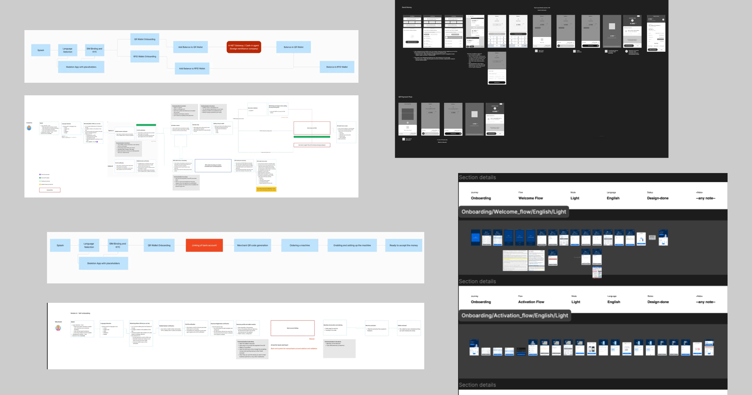
The solution was to split onboarding into three distinct stages rather than one long form.
The Welcome flow handled language selection, mobile verification and notification access — low commitment, fast, under one minute.
The Activation flow handled the heavier trust moments — Civil ID verification via PASCI, SIM binding, PIN and biometric setup.
The Profile Completion flow was progressive — collected the remaining details over time rather than upfront, reducing the perceived barrier to entry.
The target was under two minutes from download to active wallet. The industry standard at the time was over five. Getting there required removing every step that was not strictly necessary at that moment and deferring everything else to a point where the user had already experienced enough of the product to trust it.
Designing the Core Payment Flows
The payment flows were where every research insight from previous case study had to be translated into actual interaction decisions.
The QR payment flow was merchant initiated. The merchant generated the request, the user scanned and confirmed. No amount entry on the user side. That single decision removed the precision anxiety that came with manually entering KWD amounts at the decimal level, and it made the flow faster than anything that required the user to think about numbers.
The send money flow was built around how people actually think about who they pay — recent contacts, favourite contacts, frequent contacts surfaced immediately without searching. Contact access combined with name and number search meant finding someone to pay was never more than two taps away.
The payment interaction itself used a swipe to pay mechanic rather than a tap confirmation.
Swipe is harder to trigger accidentally than tap, which matters in a market where people are precise about amounts and anxious about errors. A small decision with a meaningful impact on user confidence.
The passbook gave users a transaction history with smart analytics for a quick overview of their spending patterns. Personal finance management built into the core product, not a separate feature.
What Designing for Arabic Taught Me
RTL is not a mirror of LTR. That sounds obvious. It is not, until you are actually doing it.
The language selection screen was the first moment where this became real. The screen needed to work in Arabic and English simultaneously — both labels present, both readable, both feeling native to their respective script. The cultural illustrations per language option were not decorative. They were a trust signal — telling each user that the product recognised where they were from before they had done anything.
The caveats
Flipping the layout for RTL went beyond reversing the grid.
Navigation icons that carried directional meaning had to be mirrored.
Typography had to be reconsidered — Arabic typefaces at the same point size as Latin typefaces read very differently, and the weight choices that worked beautifully in English sometimes felt heavy or thin in Arabic.
Hierarchy had to be re-evaluated because Arabic reading patterns are different from English ones.
The most important learning was about assumptions. Most digital product design — components, patterns, conventions — is built on Latin script assumptions. Padding values that feel comfortable in English can feel cramped in Arabic because the script is denser. Truncation that is invisible in English can break meaning in Arabic because words do not truncate gracefully mid-root. Every pattern I had internalised had to be questioned.
Designing for Arabic did not just make the Arabic version of KwikPay better. It made the entire system more considered.
What This Process Taught Me
Designing a product from zero is not the same as designing a feature. The decisions compound. A token set up wrong on day one becomes a tax you pay on every screen that follows. A component named carelessly creates confusion in every engineering handoff. A layout assumption left unquestioned breaks the moment you flip the language.
What this process taught me is that the most important design work is often invisible. The system. The naming. The structure beneath the surface. None of it shows up in a screenshot. All of it determines whether a screenshot is possible at all.
Designing for Arabic changed how I think about every product I will work on after this. Not because Arabic is unusual but because it revealed how many assumptions were baked into the default way I had learned to design. Questioning those assumptions did not slow the work down. It made the work more honest.
The next case study is about the visual identity of the product — the brand that lived on top of this system. See you there.